Concept
We wanted to include several symbols in the logo that symbolize Waga’s current identity.
The letter W, which is the initial of our name, represents our area of expertise, namely the Web.
The infinity symbol represents our work process, characterized by phases that follow one another and restart in a continuous cycle.
The upward-reaching shape, symbolizing growth, denotes the direction of the goals that our projects pursue.
The concept of connection represents a metaphor for the bond and strategic partnership we establish with our clients, providing valuable consultancy.
Structure
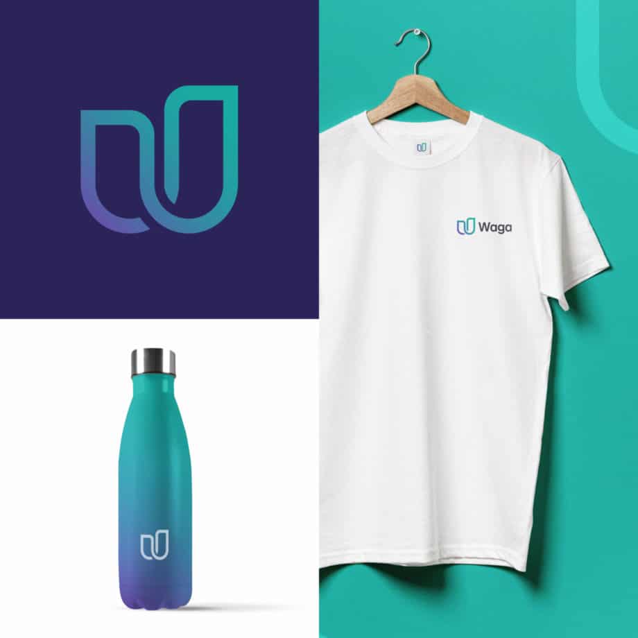
The logo features a clean and modern design, aiming to create the letter ‘W’ with elegance and minimalism. This approach gives the logo remarkable versatility, allowing for seamless adaptability across various platforms and applications.
The result is a representation of harmonious simplicity combined with contemporary design, which gives the logo an immediate recognizability. The lettering, in line with the logo, features a specially designed sans-serif style to ensure uniformity and consistency throughout the entire visual identity.
Color
For this symbol, we wanted to associate 2 colors that represent the 2 souls of the agency.
Green, which is often associated with development, growth, and sustainability, represents the technological aspect of our agency, highlighting expertise in architecture design and the development of cutting-edge web solutions. The chosen shade, vibrant and refreshing, also aims to symbolize the freshness of ideas and innovation.
Purple, which is traditionally associated with creativity and originality, represents the creative and strategic component of our work. It reflects the agency’s ability to create functional strategies and charming designs aimed at offering unique solutions.
The combined use of these two colors within the logo suggests that the agency offers a balanced blend of technical and creative skills.
It also indicates the synergy between these two souls: technology serves creativity and vice versa, allowing the agency to create technologically effective web solutions with a strong visual impact.
The color palette has been designed to harmonize perfectly with the essence of the brand, giving an aura of reliability, originality, and freshness.
Royal Purple
#6552AA
R101 G82 B170
C73 M74 Y0 K0
Light Sea Green
#16AEA1
R16 G174 B161
C75 M1 Y44 K0
Jet Grey
#453F4C
R69 G63 B76
C70 M66 Y46 K46
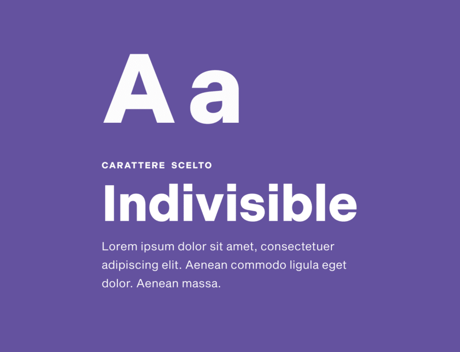
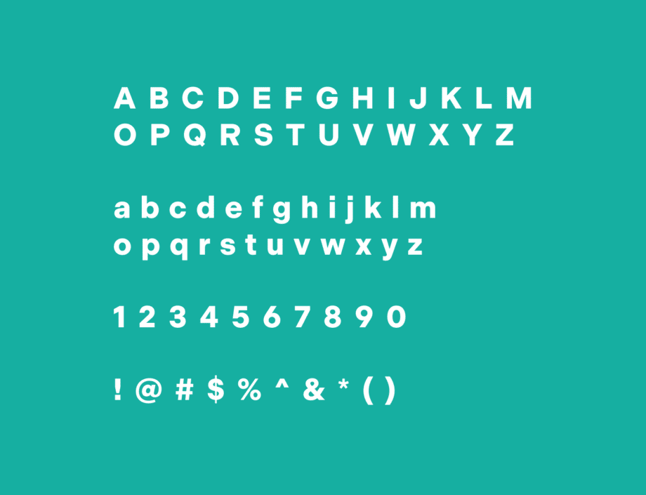
Typography
The Indivisible font is a versatile and modern typeface designed for use in the field of user interface and digital design. Characterized by clean lines and geometric shapes, this font conveys a contemporary aesthetic and clear readability. With a wide range of styles, weights, and variants, it offers many creative possibilities and it is also suitable to be used in a variety of contexts.
Future
This change is not just aesthetic, but it represents a real transformation. The new logo is the beginning of this evolution and marks a turning point, outlining a future of collaboration and growth with our customers and partners